Data Visualization in the classroom: methods & rehearsals

It’s great to develop a session as a pilot for a course, because one tends to over-prepare so much that ends up with materials for one week and ideas for later. It also helped me not to get overwhelmed feeling I could never manage to know enough.
My project entailed developing a list of readings and assignments to advance a course in which close and distant reading were not at odds, but complementary. While teaching a course on Puerto Rican, Chican@, Latin@ Literature at Brooklyn College, I reserved the 13th week to introduce digital methods. Since the previous weeks the emphasis was on performative activities and writing intensive exercises, this seemed [to me] an appropriate balanced curriculum.
A newly minted grant from the Teaching and Learning Center provided the support I needed, contributing valuable feedback and requesting specific materials—such as an annotated bibliography. From the time I sent an annotated bibliography to the Teaching and Learning Center (December) till the day I finally taught the so long planned session, five months went by. My biggest concern was not being able to give the workshop as a result of improperly installed software. That nearly happened, but not because the lab didn’t install the free software I required, I never reached that point. Bureaucracy exists, and we better factor it into our pedagogic planning. It is a fact of life. Eventually most of the students downloaded Anaconda (the software), but I had to troubleshoot installation problems in person and via BbCollaborate to get to that point. That was great for them and for me! They got to see how the terminal is used, where it is and how to open it. I, for my part, that would avoid as much as possible the terminal, became conversant with it out of necessity, to the point I finally lost the fear of it. (I might consider the utility of regaining it soon)
Because teaching is not all about content, it was important for me to present my students with some method/technology that might seem too challenging. And, show them that after a couple of steps, it is between mostly comprehensible and truly understandable, but certainly, no longer incomprehensible. The mere preparations for the workshop fostered a greater understanding of how their computers work.
This course met once weekly, three credit hours at the time (2 and a half hours). For an introduction to visualization and text analysis skills, it was perfect. As we know, time flies when learning new technologies. Of course, I couldn’t do everything I planned. Here is what we actually did:
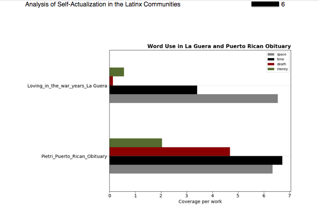
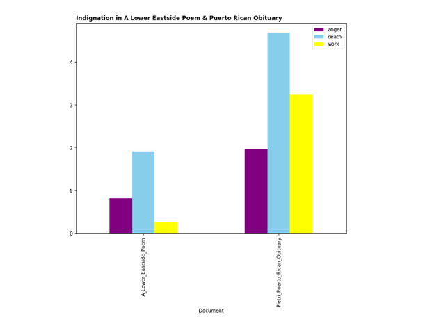
After going over the concept of semantic fields, each student chose an emotion to work with, wrote ten words that belonged to it and shared them with another student (working with another emotion) to receive suggestions/feedback. This was the point of entry to understand how LIWC (the software utilized in the data set I provided) works, and its limitations. For example, in LIWC, the word “strike” is not part of the semantic field of work. Using LIWC to analyze “Puerto Rican Obituary” by Pedro Pietri this is noticeable. Having used their critical skills over the semester, students found no difficulty questioning the “higher presence of… in this text than that text…” but they were ready to go back to the text and see why the numbers were as shown. The next step was to choose categories from LIWC (excel sheet provided) that could help contextualize this emotion in the texts. For example, if my emotion is grief, and my text is an obituary, the category “death” from LIWC might help contextualize this emotion in this text. The rest of the time was spent plotting these categories and describing the findings. This graph was to be included in the final essay. A number of additional prompts allowed me to encourage further questions about the visualizations produced, the questions that informed them and the ones they generated. In this case, it was about the inclusion of a graph in a paper, but it is actually a good practice in relation to the inclusion of any element in a critical/research paper. Here are some of the results:


We went over different types of graphs. Some would argue you can do this with excel (this is ten times better though). That can be true, but you don’t get to have, among many other things, an idea of how coding works. The process was key. On the other hand, once at the door of digital humanities, there can be a lot of pressure to advocate for them, as if this field is powerless; it is not. I admire its endeavors (in its Alan Liu’s version), but I don’t feel compelled to promote the field while teaching digital tools and data visualization. My interest lies in fostering critical thinking utilizing a contemporary array of tools. Hence, an approach that includes current software, platforms and sites is necessary.
Critical imagination is not an oxymoron: it is linking skills and purpose, strengthening new critical skills. With this in mind, I might now need to go back my initial annotated bibliography and decide what stays and what goes. I will give this pedagogical toolbox a second try for the course I will teach in the Spring 2018 semester.
Bureaucracy exists, and we better factor it into our pedagogic planning. It is a fact of life.
Because teaching is not all about content, it was important for me to present my students with some method/technology that might seem too challenging. And, show them that after a couple of steps, it is between mostly comprehensible and truly understandable, but certainly, no longer incomprehensible.
Critical imagination is not an oxymoron: it is linking skills and purpose, strengthening new critical skills.
